WANNASOFA Redesign
A UX/UI redesign of an existing website for secondhand designer furniture. Drawing heavy inspiration from styles most commonly used during the Mid-Century Modern era.

Who
is WANNASOFA?
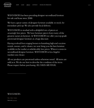
WANNASOFA is a Los Angeles-based secondhand designer furniture store with an extensive collection.
They operate with very few staff and majority of the communication with their customers are via text or phone call.
Given its secondhand nature, customers need to be aware of important information before viewing or purchasing.
Who
is the team?
Team
Christie Lee
Supervisor
Shawn Sprockett
I was the main contributor for this redesign project. My objective was to establish a streamlined information hierarchy and a visually engaging style that matched the theme effectively.
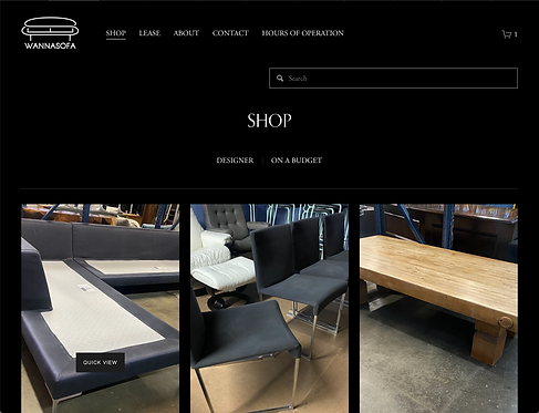
Design
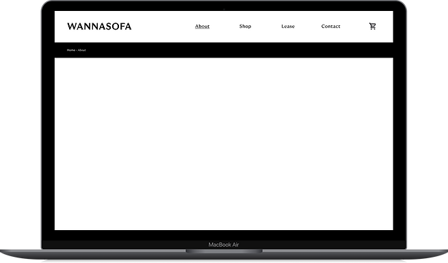
The redesign draws inspiration from Eames' and Ladislav Sotnar's graphic styles, leading to a color-blocking approach.
The goal was to strike a balance between allowing the eye to explore and emphasizing key page elements.

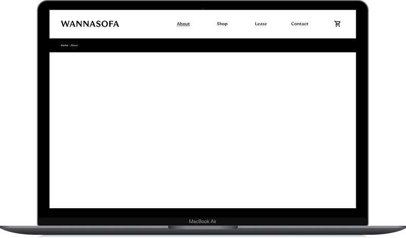
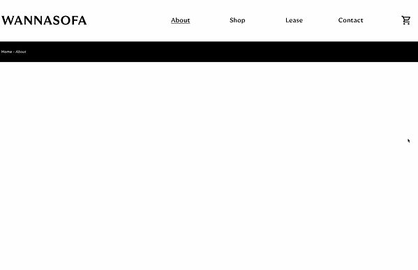
Implementing straightforward solutions like incorporating taglines, introducing user-friendly categories for efficient search, and organizing content using a color-blocking approach not only enhanced the website's professionalism but also improved readability.
Redesign Video
If you're curious, feel free to go through my presentation video where I dive into detail about my critiques of the original website, my research process and the final product.
Why Redesign?

As the project progressed, the main challenge became balancing the appearance of a polished e-commerce site with the thrift store's secondhand identity.
There were a multitude of problems with the existing site:
*The following are quick summaries of the problems identified with the existing site. If you're curious, check out the full presentation for a detailed breakdown.
1. Illogical and inappropriate images of the products and its defects
2. No visual hierarchy
3. Illogical presentation of information (either overwhelming or not enough)
4. Color palette and typeface renders readability low and is giving off the wrong vibe.
Research
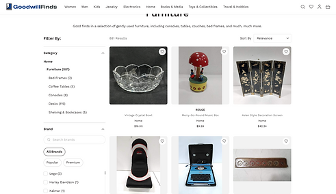
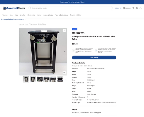
Precedent Study | Goodwill
Unfamiliar with secondhand e-commerce sites, I sought inspiration from Goodwill's website, which excelled in clarity through its composition, browsing elements, and detailed defect descriptions.
Goodwill's example helped tremendously in identifying features that WANNASOFA's website could benefit greatly from.
Most of the features I aimed to implement were related to information hierarchy and search efficiency.
Assumptions
As this was a school project, I had to make certain assumptions, and with my background in architecture, I felt fairly confident in the following about the average customer:
They are older and/or have an interest or experience in design.
Generally upper middle class and above due to the prices of even secondhand pieces ranging from several hundred to tens of thousands.
Would be described as "old school" in their habits.
Intermediate to advanced knowledge of furniture design history and its designers.
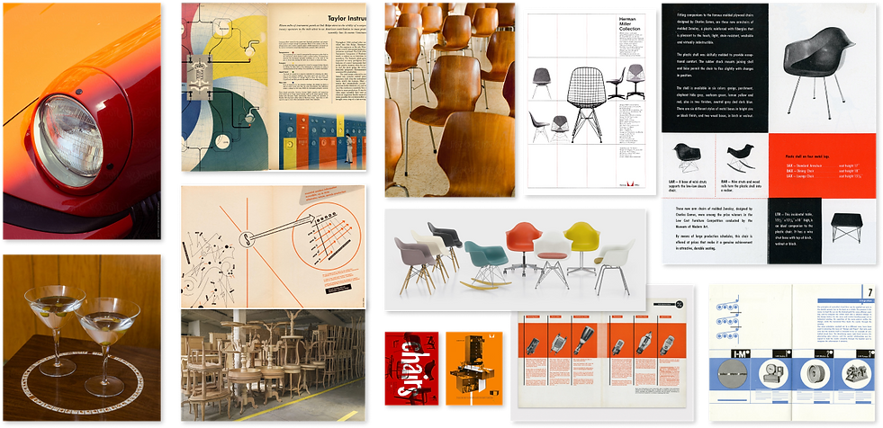
Inspirations
Two key figures inspired my design: The Eames' and Ladislav Sutnar
Ray and Charles Eames were a design duo whose approach to design emphasized functionality and mass production while maintaining a strong sense of aesthetics, and their work continues to influence and inspire designers to this day.

Ladislav Sutnar was an influential graphic designer and information architect known for his contributions to modernist graphic design. Sutnar's work emphasized clarity, organization, and the effective communication of information.

Click to learn more about these important figures
Moodboard
Next Steps
If I were to take this project further, I would prioritize the following tasks:
With such a niche style, this redesign would benefit greatly by refining its new microinteractions and animations.
Perhaps more visually distinct variations depending on the function of the page to avoid eye fatigue.
Test the product to different users and stakeholders to get better understanding of natural user flow for these kinds of e-commerce websites.